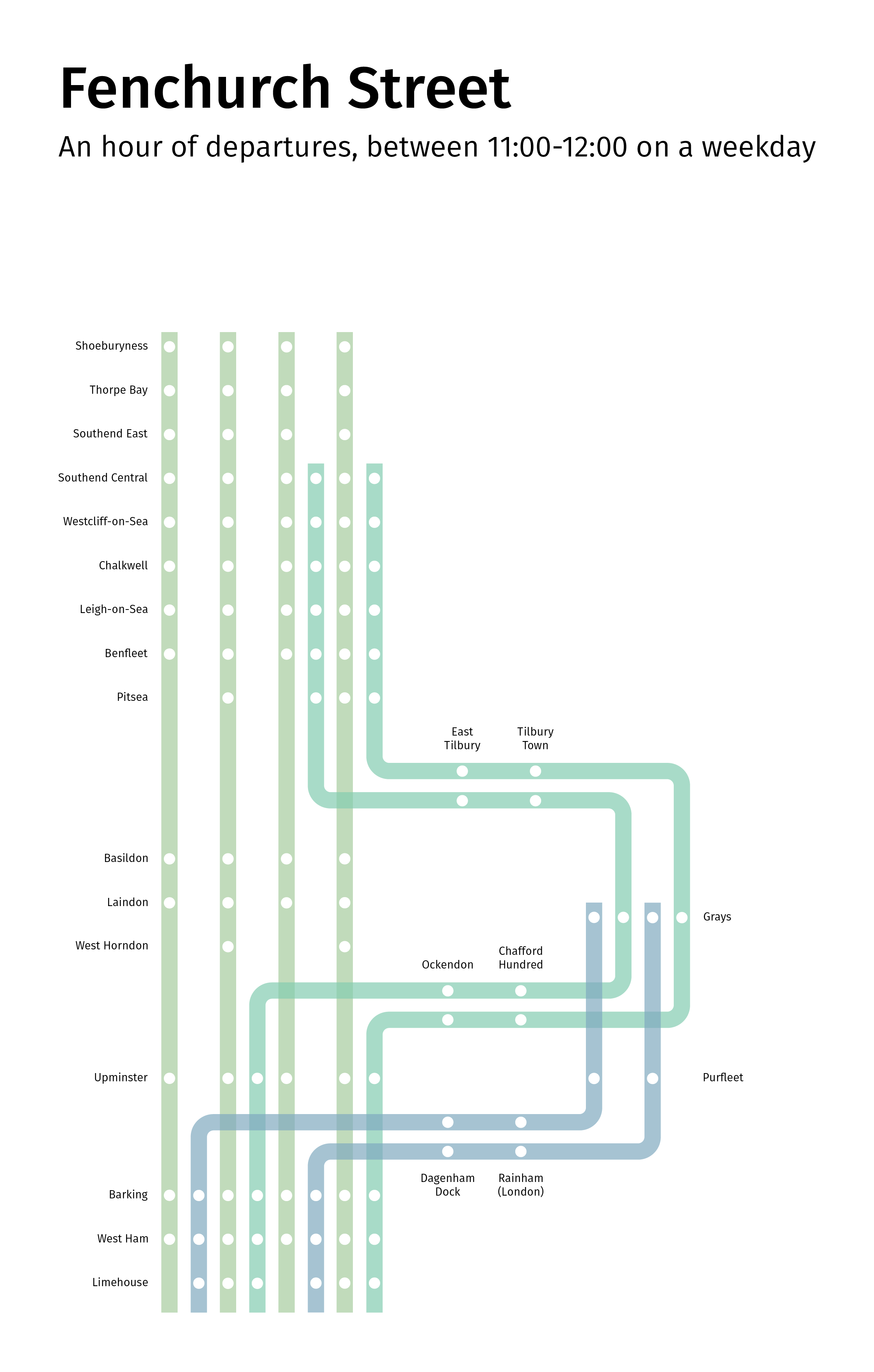
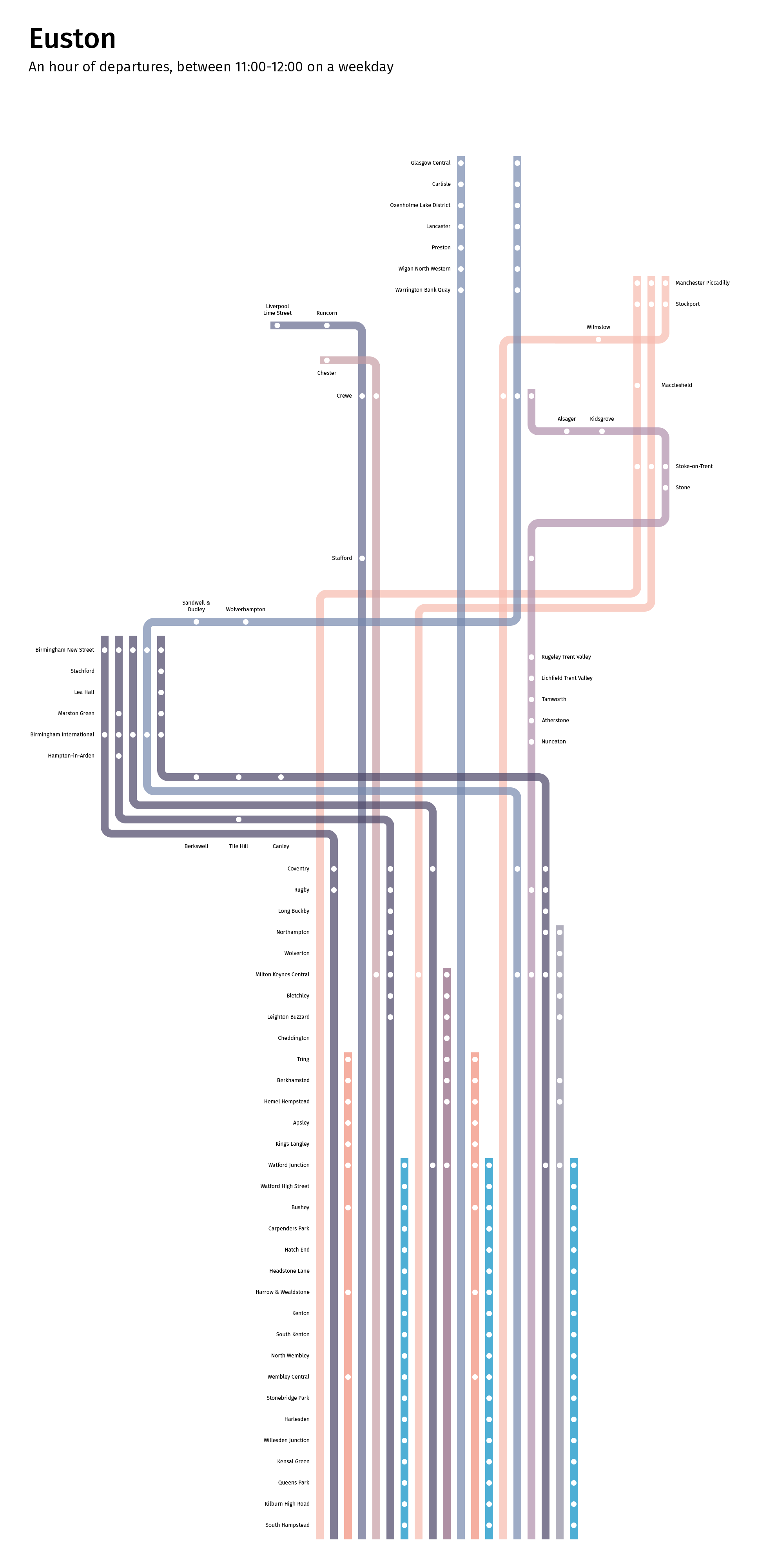
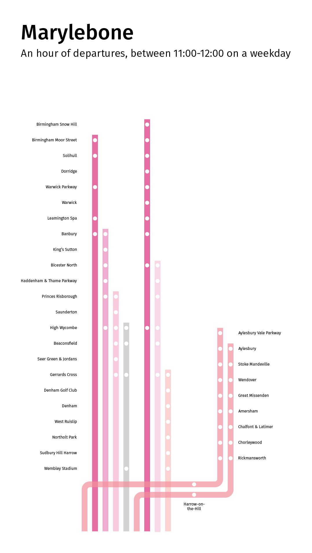
Following on from the Mapping London’s Reach project, I decided to try visualising the timetables within the same hour (11am-12pm). A lot of planning is put into timetables, with the aim of squeezing as many services as possible along lines with infrastructural limitations. The result is that you often see patterns forming, where services with different calling patterns are arranged in such a way as to minimise clashes and delays (for example, a fast service will run first, followed by a semi-fast, then a stopping service; this means that the semi-fast service won’t catch up with the fast service, and the stopping train won’t get stuck behind the semi-fast one). I liked the idea of being able to show these patterns through visualising them on a map, and thought a schematic version would be much better suited to this than the geographic maps produced in order to show the “reach” of different termini.
Again, the times were taken from the December 2014 timetable.